
TIMELINE
5 Months
TEAM
Sabrena Chedid
Joseph Chen
Selena Sun
ROLE
Product Designer
SKILLS
UX Research
Visual Design
Wireframing
Prototyping
Sketching
STORY
Our client, the coordinator of the Washtenaw County Rain Garden Program, sought a redesign to attract a broader demographic and increase participation. Through user research, we identified key challenges around community engagement, accessibility, and motivation to get started.
To address these needs, we designed a beginner’s guide, community section, photo gallery, help page, and events page, which users found more engaging and exciting during comparative usability testing.
THE BACKGROUND
Washtenaw County promotes rain gardening education to protect surface water and the environment.

Our client, Susan Bryan, is the coordinator of the Rain Garden Program at the Washtenaw County Water Resources Office. They are a governmental body that seeks to inspire residents and communities of Washtenaw County to protect surface water and the environment while maintaining necessary drainage.
They oversee the Rain Garden Program, which teaches homeowners how to design and install rain gardens. Rain gardening is an environmentally friendly practice that captures stormwater runoff before it enters local rivers and supports local biodiversity.
THE PROBLEM
The existing website does not effectively attract or inform new participants, reducing interest in the program.
The current Washtenaw County rain garden website, the primary source of information about the program, has gaps that limit engagement with potential new rain gardeners. People using the website struggle to find relevant information presented in an engaging, aesthetically pleasing, and inspiring way, which reduces participation and hinders the program's ability to expand its reach and support sustainable practices.
THE OBJECTIVES
We aim to support the client’s mission to expand rain gardening by improving their site's user experience.
➡️
By making the website more engaging and relatable to potential rain gardeners, we aim to broaden participation and promote long-term sustainability. The following objectives are designed to achieve this mission and are to be validated through user testing:
📉 Lower perceived barriers to joining the program…
through creating a guide that simplifies and summarizes the steps of rain gardening.
🧑🧑🧒🧒 Build a sense of community for the rain gardeners…
through a storytelling tool that fosters connections between prospective and current rain gardeners.
🔎 Enhance website navigability for rain gardeners…
by improving the information hierarchy and reducing search time for core information.
THE CONSTRAINTS
We faced three significant constraints that heavily influenced how we designed our solution.
🎨 Restricted Design Style
As part of the county's website, our redesigns needed to follow its style. Without access to the official style guide, we aligned our designs as closely as possible with the existing style while maintaining visual appeal.
📸 Very Few Visual Content
Even though our client had many photos, most were low quality and not suitable for the website. This made it challenging to create engaging visual content, even though it was essential to the user experience.
🖥️ Limited Technical Ability
Since our client used a website builder and had limited technical knowledge, their ability to implement complex features was restricted. Therefore, we could not propose anything too advanced.
THE SOLUTION
We redesigned five pages of the program site to boost engagement, increase accessibility, and inspire action.
After our research phase, we identified four initial design requirements: a step-by-step beginner’s guide, a mentorship feature, an events calendar, and a photo gallery with testimonials. However, through three rounds of iterative feedback from our client, peers, and user testing, along with project constraints, we refined these ideas. Some were retained, while others were adapted or replaced.
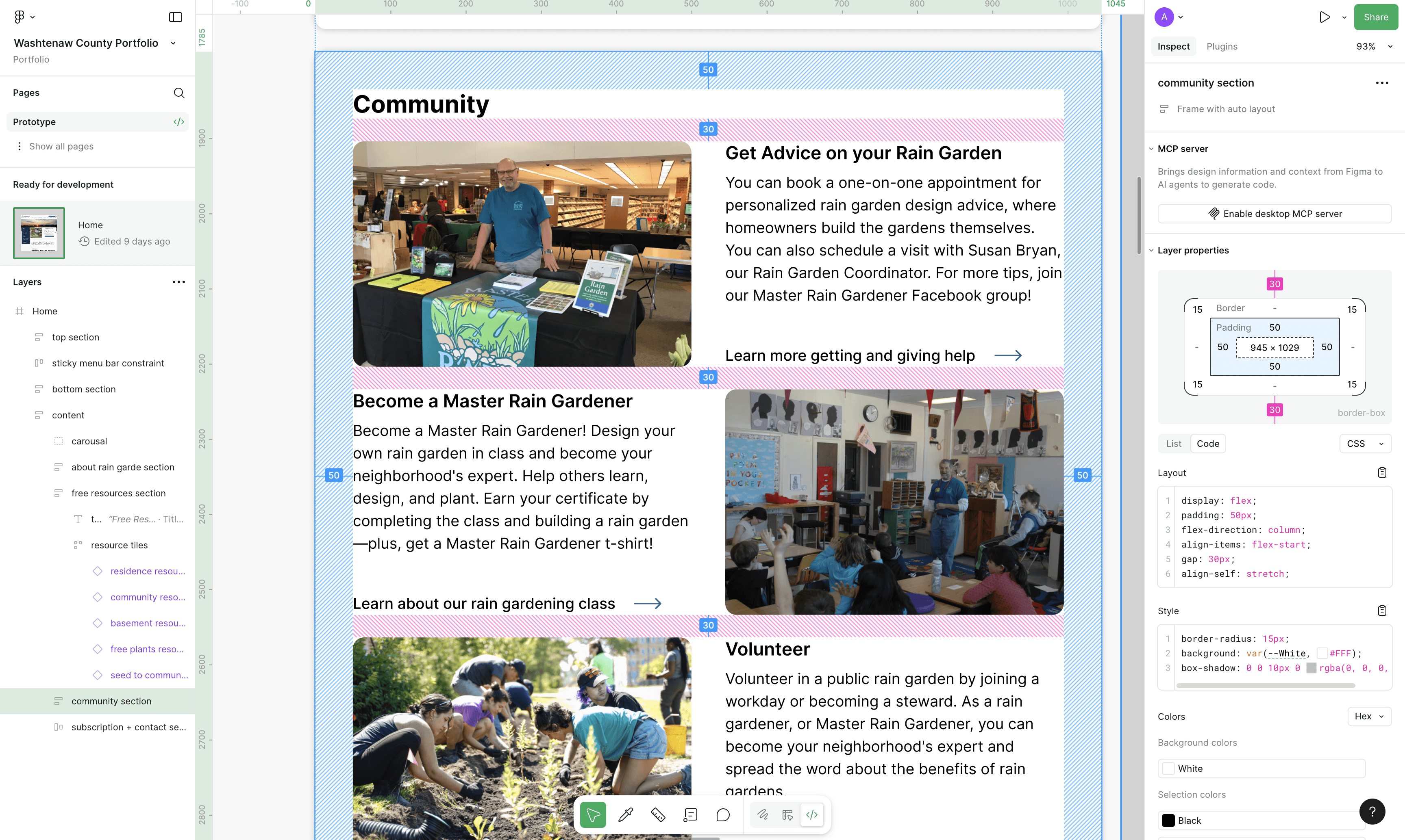
Homepage
Added a community section to strengthen community engagement and reorganized content for easier browsing.
Step-By-Step Guide
Get and Give Help
Events
Featured Stories
SUCCESS
A comparative usability study showed that our redesign significantly improved the user experience.
We conducted an online between-subject comparative usability test with 19 participants, who were randomly assigned to either the current or redesigned website. We measured four quantitative and three qualitative measures. The redesigned site showed substantial improvement across all metrics.
Quantitative Measures
✅ 77% to 98%
In Task Success
⏱️ 70% Faster
Time on Task
📈 4.48 to 6.31
In SEQ Score
📈 35 to 85
In SUS Score
Qualitative Measures
🤔 100% to 18%
Less Confusion
🧑🧑🧒🧒 13% to 100%
Felt Connected
💪 13% to 100%
Felt Gardening Was Easier
RESEARCH (GOALS)
Our goal is to understand the needs and behaviors of current and potential rain gardeners.

These questions were created to help us reach our goal.
1
What factors influence individuals to discover and become interested in rain gardening?
2
What barriers prevent individuals from starting rain gardens?
3
How can the website inspire and engage users in starting and maintaining rain gardens?
4
What motivates individuals to begin their rain gardens?
RESEARCH (INTERVIEWS)
We interviewed six experienced rain gardeners to gain a comprehensive view of their journey.
Methodology
We conducted online interviews with six current rain gardeners. This method enabled follow-up questions, allowing us to explore their thought processes and to capture the nuances of their journey from initiation to long-term participation. Participants were recruited through the client’s newsletter with a $30 incentive, and all provided consent before the interview. The three points below summarize the research focus of our interview.
👣
Explore their rain gardening journey, including meaningful milestones, and the perceived rewards and unexpected benefits they have experienced.
🚦
Identify the challenges they encountered when starting a rain garden and the motivations that helped them begin and persevere through their journey.
🌐
Understand the website’s role in their journey, highlighting which features they found useful or lacking, and additional elements they would find helpful.
The online interview has five main sections, each targeting different parts of the research focus.
Results
After completing the interviews and analyzing the transcripts, we conducted a card-sorting exercise to synthesize our findings. This process helped us categorize key insights into three main themes.

📍 Entry Point
Initial Learning: All participants began by consulting experts or taking a rain gardening class to deepen their knowledge.
Structured Guidance: Many appreciated structured learning or step-by-step instruction, which made the process easier to follow.
Physical and Time Constraints: The main obstacles were physical labor and time commitment, with some taking years to complete their garden.
👥 Social Interactions
Low Website Engagement: Most participants had not visited the site recently, but one said the homepage is essential for attracting newcomers.
Need for Clearer Guidance: Participants want a simpler, clearer step-by-step guide to starting a rain garden.
Desire for Community: They expressed a strong need for more opportunities to connect with other gardeners.
🌐 Website Feedback
Interest from Passersby: Half of the participants shared that they enjoy passersby who look at their gardens and ask questions about their rain gardens.
Plant Exchanges as Connection: Exchanging plants is a common way for members of the rain gardening community to interact with one another.
Teaching and Mentoring: Many enjoy helping and educating other rain gardeners through in-person events like community classes and volunteering, or online groups like Facebook groups.
Preference for In-Person Engagement: Rain gardeners strongly prefer face-to-face interactions over the online engagement formats that became common during COVID.
Desire for a Stronger Community: Many participants have expressed wanting more engagement or seeing the potential in a rain gardening community.
RESEARCH (SURVEY)
We gathered 151 survey responses, capturing user motivations, challenges, visuals, and desired features.
Methodology
We gathered 151 responses, with 58% from experienced rain gardeners and 42% from potential rain gardeners, defined as individuals interested in sustainability and gardening. The survey format allowed us to capture diverse perspectives. Participants were recruited through Facebook gardening groups and the client’s newsletter, with a small incentive offered to thirty randomly selected respondents.
▶️
Understand how participants discovered rain gardening and what sparked their interest.
🚦
Identify the barriers they face and the motivations that drive them to pursue rain gardening.
🎁
Determine the most compelling incentives that would encourage participation.
💎
Discover the features and information they find most valuable on the website.
📸
Assess which visuals most effectively attract and engage users.
🧑🧑🧒🧒
Understand the community features they desire to foster engagement and support.
Our survey included six sections, each designed to gather insights aligned with our research focus. One section featured a photo elicitation exercise to understand which visuals users prefer.
Results
We visualized the quantitative data and coded open-ended responses to identify the most frequently mentioned themes across motivations, challenges, and visual preferences.
Entry Point and Motivations
Challenges and Support
Visual Learning Preferences

Social Discovery Channels: 46% learned about rain gardening through social events, 41% through yard signs, and 27% from friends, family, or neighbors.
Environmental Benefits as Motivation: 88% started rain gardening to reduce water runoff and pollution, while 82% wanted to support local wildlife.
Aesthetic Appeal as Motivation: Approximately 50% of respondents were motivated to start by wanting to improve the appearance of their yard.
RESEARCH (SYNTHESIS)
We synthesized key insights about user journeys and needs from interviews and surveys into five main points.
We compiled key findings from both interviews and surveys and organized them using affinity diagramming. By grouping similar ideas according to recurring patterns, we identified overarching themes. The process enabled us to transform our data into meaningful insights that informed our research findings.
Five Key Findings Validated By
Interviews and Surveys
💪 Physical Labor and Time Discourage Participation
Manual labor and time commitment are major barriers, with many participants citing digging and installation as the most challenging steps.
🧑🧑🧒🧒 Interactive Community Increases Retention
Participants want more opportunities to connect, especially in person, indicating that community features may improve long-term engagement.
🧑🏫 Structured Learning Facilitates Onboarding
Many gardeners begin through classes or expert guidance due to limited knowledge, showing the need for clear, beginner-friendly learning resources.
📸 Visual and Instructional Content Increases Engagement
Before-and-after images were the most engaging, but users also want clear instructions alongside visuals to feel confident getting started.
🌿 Environmental Benefits are the Strongest Motivator
Most participants were motivated by reducing runoff and supporting wildlife, indicating environmental impact is the primary driver for participation.
SYNTHESIS (USER PERSONAS)
We developed two user personas, one new and one experienced rain gardener, based on research findings.
We created one experienced-gardener persona and one new-gardener persona to accurately represent the users our redesigned site targets. Our goal is to retain and engage existing gardeners while also attracting and supporting newcomers.

Sally represents those who are interested but feel overwhelmed by the process. By providing clear guidance, step-by-step instructions, and mentorship, the website helps convert curiosity into action.

Jane values community and mentorship opportunities. By fostering connections between experienced and new rain gardeners, the site enhances engagement and strengthens the community.
SYNTHESIS (USER SCENARIOS)
We created a scenario for each persona to explore solutions that align with user needs and motivations.
After understanding our target users, we created scenarios to show how our design solutions address their pain points in real contexts and help them reach their goals.
Sally's Scenario
Sally’s journey highlights common beginner challenges, including a lack of knowledge, fear of failure, and limited time. Her scenario highlights the importance of simple, supportive features, such as a beginner’s guide and mentorship, in helping new gardeners feel confident and take action.
🧨 Trigger
After noticing a rain garden sign in her neighbor’s yard, Sally, a busy professor with little free time, becomes curious about rain gardening due to its environmental benefits.
🚧 Challenge #1
One evening, she searches online for more information. She hopes to learn how to start a small, manageable garden, but the complexity of different guides leaves her feeling overwhelmed.
💡 Solution #1
Then, she stumbles upon the rain gardening page on the Washtenaw County website. The homepage catches her attention with a section named “Beginner’s Guide to Rain Gardening,” which offers a step-by-step tutorial. Encouraged by the simple structure, she clicks on it and follows an interactive guide that walks her through site selection, plant choices, and setup tips.
🚧 Challenge #2
However, she still feels unsure if she can build the garden alone.
💡 Solution #2
She then notices a “Find a Mentor” feature connecting beginners with experienced gardeners, relieving her of her fear of failure. She signs up for mentorship and receives a welcome email with a clear action plan, giving her confidence knowing she can get help if she gets stuck.
🎉 Outcome
She feels excited and motivated rather than intimidated, as the site has provided a clear starting point. The availability of structured guidance and mentorship makes rain gardening seem more achievable, resolving her initial uncertainty and increasing her likelihood of following through.
Jane's Scenario
Jane’s experience emphasizes the importance of community engagement and mentorship for long-term users. Her scenario shows how features like a community forum, mentorship program, and events calendar help experienced gardeners stay involved and contribute.
🧨 Trigger
Jane, an experienced gardener with two established rain gardens, has been practicing for a few years but wishes for more interaction with fellow gardeners.
🚧 Challenge #1
She enjoys teaching others, sharing her knowledge, and attending sustainability events, but struggles to find ongoing rain gardening community events.
💡 Solution #1
One day, she visits the rain gardening page on the Washtenaw County website, looking for social opportunities, and sees a section titled “Join the Community.” Curious, she clicks on it and discovers a forum where gardeners share their experiences, solve issues, and organize meetups. She also finds a “Mentorship Program” that pairs experienced gardeners with newbies. Excited by the opportunity, she signs up to be a mentor, feeling fulfilled by the chance to help others.
🚧 Challenge #2
However, she still wishes there were more in-person events.
💡 Solution #2
Browsing further, she finds a local events calendar listing upcoming rain gardening workshops and plant exchanges. She registers for a meetup, feeling satisfied that she now has a way to connect with both new and experienced gardeners.
🎉 Outcome
The site has given her what she was looking for: a way to stay engaged, share her knowledge, and be part of an active rain gardening community, reinforcing her commitment to the practice and the community.
CLIENT INPUT
Although we explored the idea of a community forum, our client shared that it would require too much technical effort on their end, so we decided not to proceed with that solution.
SYNTHESIS (DESIGN REQUIREMENTS)
We identified four main design requirements based on our scenarios and client discussions.
The step-by-step guide, events calendar, and mentorship program were derived from the scenarios. The photo gallery with testimonials was another solution we developed to fulfill users’ desire for a stronger sense of community and to provide a visual representation of various gardening journeys from start to finish.
🧑🏫 A Step-by-Step Beginner’s Guide
A structured, easy-to-follow guide with visuals and explanations to simplify the rain gardening process.
📸 Photo Gallery with Quotes
A section showcasing different types of successful rain gardens and their journey to inspire others.
🗓️ Event Calendar
A feature displaying upcoming rain gardening events and plant exchanges.
👥 Mentorship Connection Feature
A feature that pairs beginners with experienced rain gardeners for guidance.
DESIGN (OVERVIEW)
Our design process consisted of three phases and was guided by input from peers, the client, and user testing.
Although we incorporated peer feedback and user testing, our client remained the most consistent influence throughout the process. Their constraints, particularly technical limitations and the lack of high-quality visual content, also played a significant role in shaping our design decisions. The three phases are:
1
We brainstormed and defined key design requirements, explored how to integrate them into the existing site, and created initial sketches.
➡️
2
We presented these initial sketches to our client and peers, incorporated their feedback, and developed low- and mid-fidelity wireframes.
➡️
3
We refined the wireframes with client input and held user testing to solve navigation issues, ensuring a cohesive experience.
CLIENT INPUT
Before starting our initial sketches, our client requested that we include a storytelling tool, as it was one of their long-standing priorities.
DESIGN (PHASE 1)
We brainstormed and sketched the five core redesigns and changed page layouts to improve navigation.
The core features include the four must-have design requirements and a storytelling tool requested by the client. However, rather than building one dedicated storytelling page, we incorporated storytelling elements across the homepage and key features.
Initial Sketches of the Five Core Redesigns
Homepage
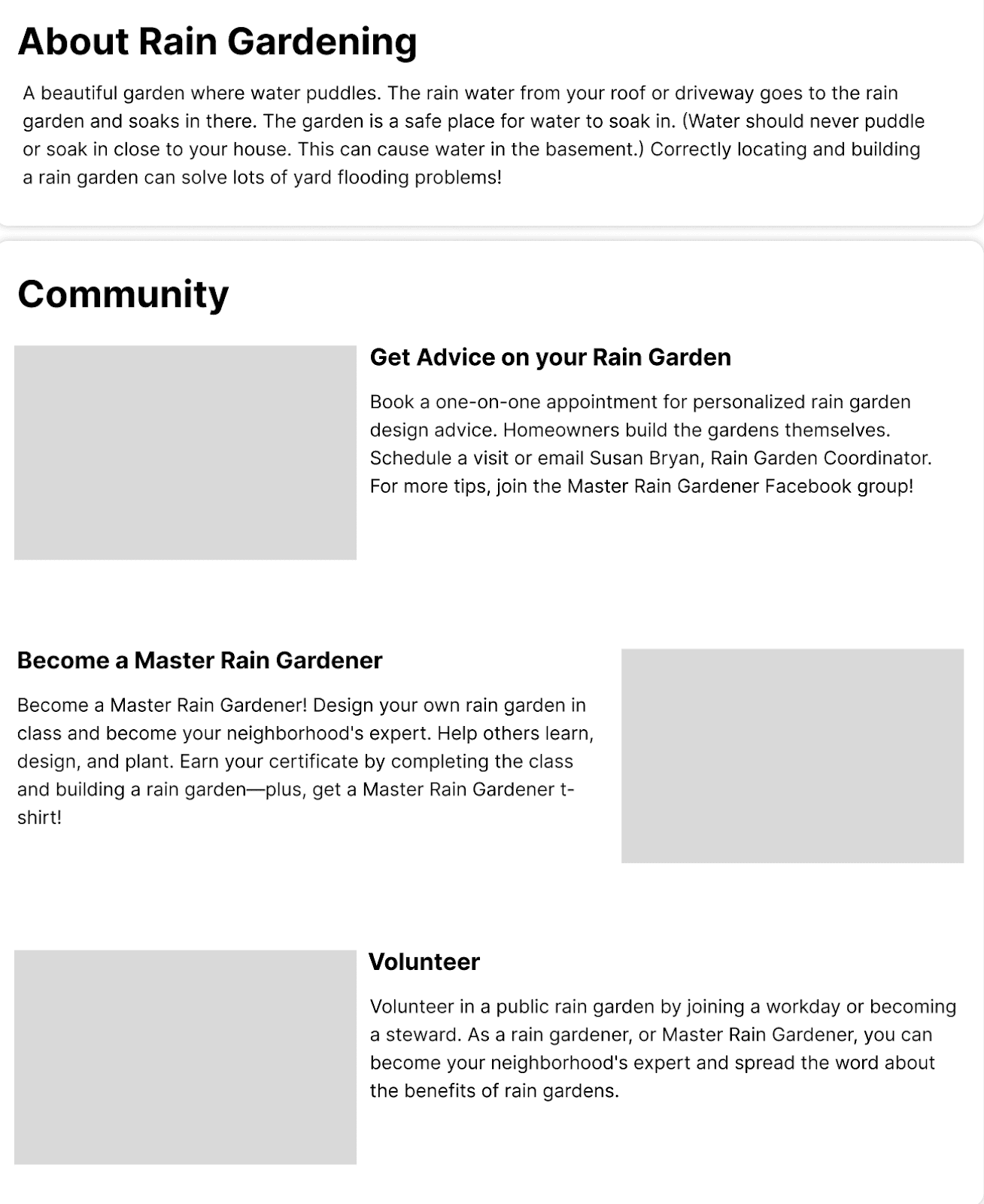
Introduced a “Community Highlight” carousel to share gardener stories. Unified community resources into one section.

Events Calender
Replaced the list format with event cards and added filters to help users find relevant events more easily.

Detailed Guide
Developed a simplified five-step process with embedded FAQs and a full FAQ section to support beginners.

Mentor Program
Created a system using Google Forms to match mentees with mentors while giving the client flexibility in pairing.

Photo Gallery
Transformed into a storytelling-driven slideshow with quotes to make gardening journeys relatable.

DESIGN (PHASE 2: CLIENT FEEDBACK)
After reviewing our sketches with the client, we identified three key points to guide our next iteration.
In our weekly meeting, we shared the initial sketches with our client to understand what she liked, what else she wanted redesigned, and any concerns she had with our ideas.
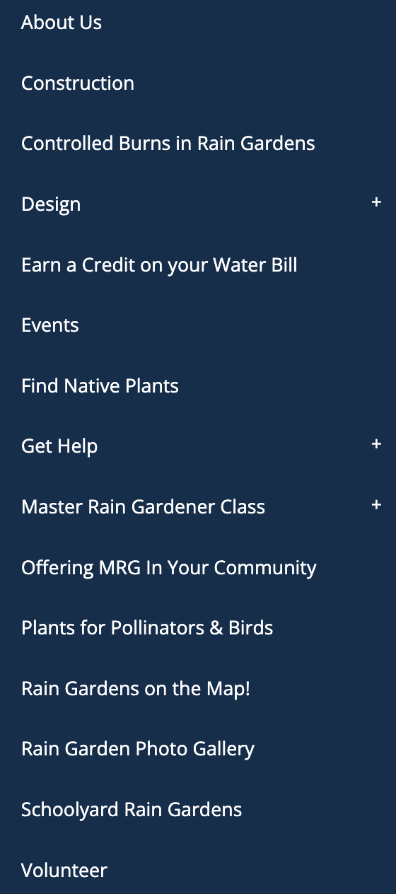
Reduce Menu Options
The client found the menu overwhelming, so we combined related pages and reordered items to prioritize key information.
Unify Help Content
Less Mentorship Focus
➡️

DESIGN (PHASE 2: DESIGN CRITIQUE)
Our instructors and peers provided feedback, offering suggestions to improve their readability and navigation.
After receiving client feedback, we developed our sketches into wireframes based on their suggestions. Then, we held two critique sessions, one with instructors and one with classmates, and identified five takeaways.
Reducing Content
We were advised to reduce text on the homepage, so we removed unnecessary content to make it shorter and more readable.
Expandable Help Page
Remove Top Carousel
Expandable FAQ
Help Page Hierarchy

➡️
Reducing Content
We were advised to reduce text on the homepage, so we removed unnecessary content to make it shorter and more readable.
Expandable Help Page
Remove Top Carousel
Expandable FAQ
Help Page Hierarchy
➡️
DESIGN (PHASE 3: CLIENT FEEDBACK)
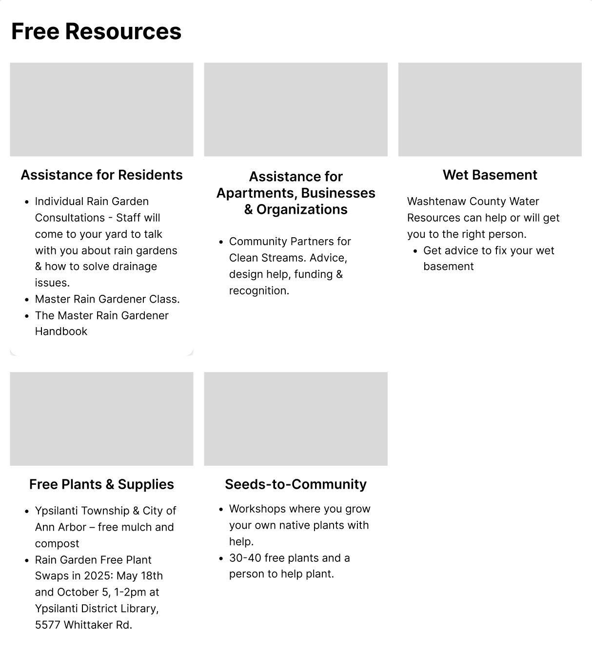
After reviewing our new wireframes, the client requested that we add a free resources section to the homepage.
In our weekly meeting, we reviewed all the wireframes and explained the design changes. The client was satisfied and approved the final mid-fidelity designs, with only one additional request.
Free Resources
The client asked us to add a free resources section to highlight their climate focus, so we included it and made it easy to skim.

➡️
DESIGN (PHASE 3: USER TESTING)
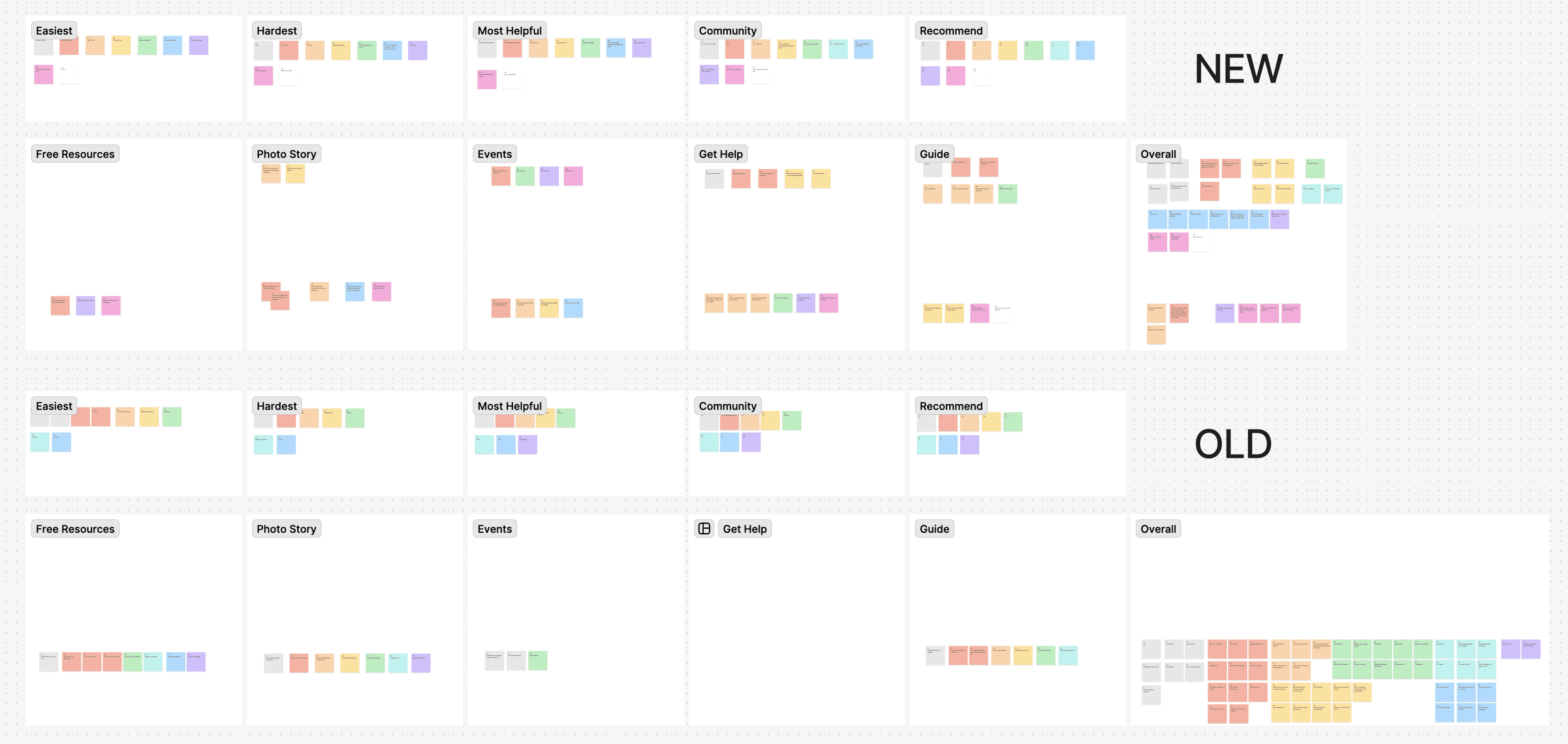
Through user testing with four participants, we identified and implemented two key design changes.
Methodology
We conducted one round of user testing with our mid-fidelity prototype, assigning five tasks that targeted each of the redesigned pages: the homepage, events page, help page, featured photo stories, and step-by-step guide. While participants attempted the tasks, we observed their difficulties and asked clarifying questions. We tracked task success rates and problem severity to identify usability issues and prioritize improvements.
Results
All the participants completed all the tasks. The tasks of returning home, finding volunteer opportunities, and finding plant swaps were all easily completed. However, the other two tasks of finding the guide and featured gardening stories encountered some difficulties.
Misleading Labels
Users struggled to find the photo stories because the photo gallery label did not reflect the content, so we renamed the page and button to “Featured Photo Stories” and “Read More Rain Gardener Stories.”
Confusing Page Title


➡️


DESIGN (FINAL PROTOTYPE)
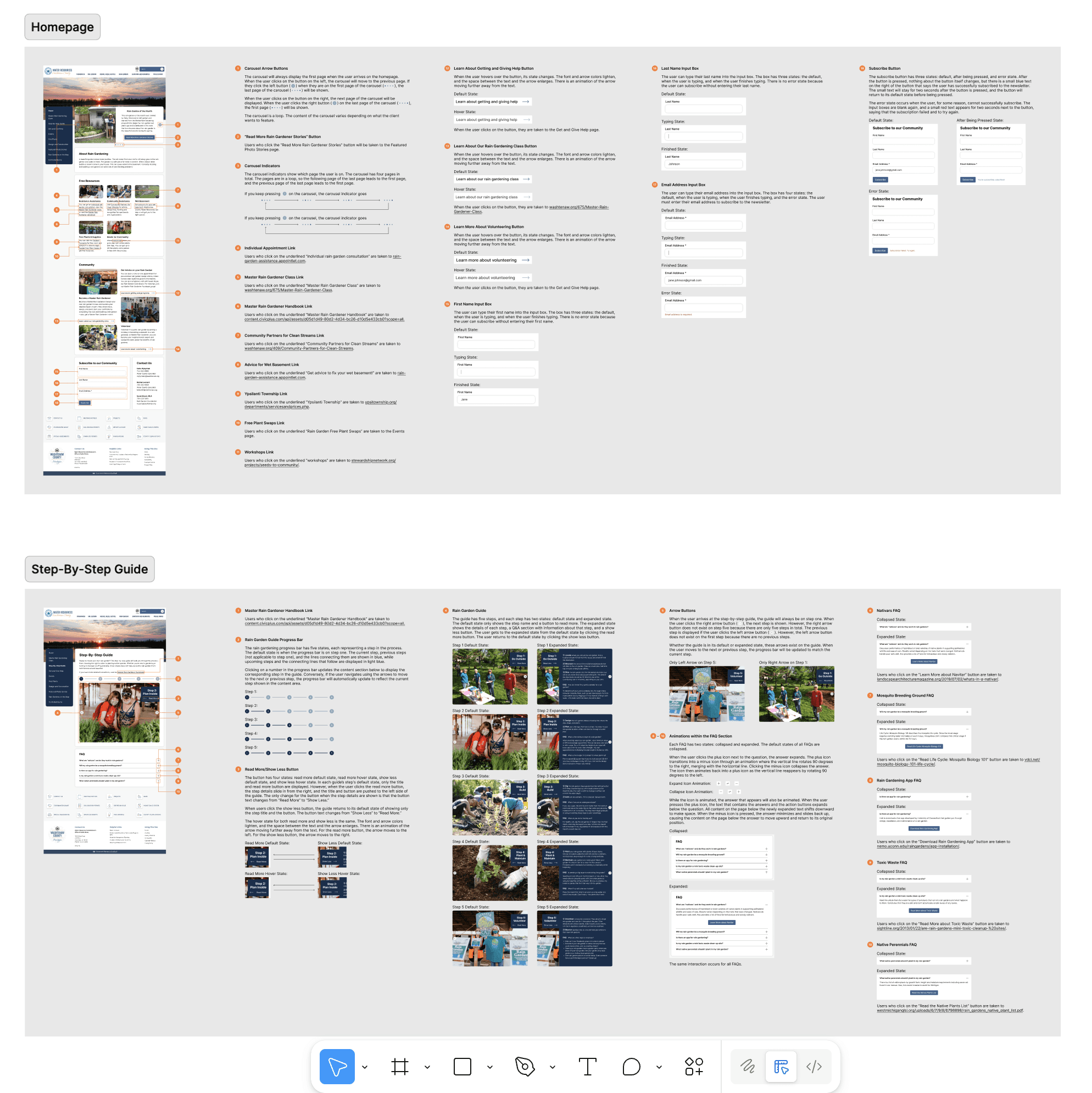
We finalized the design based on all feedback and created an interaction map to show how it can be used.
The highlights and descriptions of the five redesigned pages are shown in the solution section of the overview. If you would like to explore the prototype yourself, click here.
In case you do not know how to navigate the prototype, the interaction map below shows which buttons trigger specific actions and which options are available on each page. The squares are the pages, and the circles are what users can do on that page.

EVALUATION (RESEARCH GOALS)
Our goal was to evaluate navigation, community perception, and approachability in the redesigned site.
Our Guiding Research Questions
1
Can users easily navigate critical pages, such as events, help, and the guide?
2
Does the new structure reduce cognitive load and make rain gardening more approachable?
3
Does the redesign enhance community engagement?
4
What usability issues persist in navigation or content comprehension?
Qualitative Metrics
🔎 Navigability
🧑🧑🧒🧒 Sense of Community
🤗 Approachability
🚧 Usability Issues
Quantitative Metrics
✅ Task Completion Rate
The success rate of users completing tasks.
⏱️ Time Spent on Task
The time they spent on completing each task.
📈 SEQ (Single Ease Question)
Measures the perceived ease of task completion.
📈 SUS (System Usability Scale)
A usability survey to assess overall experience.
EVALUATION (STUDY APPROACH)
We used online between-subject comparative usability testing to compare our redesigned and current sites.
Participants were randomly assigned to either the redesigned or the current version of the website, with a focus on minimizing carryover effects. The study consists of three parts:
🎬 Welcome and Consent
Introduction to our usability testing and collecting consent forms.
➡️
📝 Task-Based Testing
Participants completed five tasks and filled in a SEQ for each task.
➡️
💬 Survey and Interview
Participants completed the SUS survey and provided feedback.
The usability testing materials are attached here for reference.
19 participants were recruited, with 8 testing the original site and 11 testing the redesigned version. They were recruited from our networks or from the contact list we compiled during the research phase.
EVALUATION (QUANTITATIVE FINDINGS)
We saw strong improvements across all quantitative metrics, proving that our redesigned site performs better.
SEQ is on a 7-point scale, where 1 is very difficult and 7 is very easy, while the SUS score ranges from 0 to 100. Scores above 68 are considered above average, while those below indicate below-average usability.
✅ 77% to 98%
In Task Success
Key Improvements
25% → 100% for reading a rain gardeners' story
63% → 91% for finding the first step of the guide
Key Improvements
115s → 19s for finding the guide’s first step
75s → 10s for exploring free resources
⏱️ 70% Faster
Time on Task
📈 4.48 to 6.31
In SEQ Score
Key Improvements
1.63 → 6.45 for reading a story
3.00 → 6.00 for finding the guide’s first step
Key Improvements
Positive statements saw significant increases.
Negative experiences dropped notably.
📈 35 to 85
In SUS Score
EVALUATION (QUALITATIVE FINDINGS)
We saw clear improvements in navigability, sense of community, and approachability with the redesigned site.
After transcribing the interviews and organizing the insights through card sorting, we identified our key findings.
🤔 100% to 18%
Less Confused
🎉 Simplified Navigation
User-friendly for all ages, increased accessibility to various resources, and visually appealing designs.
🚧 Issues
Difficulty locating volunteer opportunities and the hover effect in the step-by-step guide.
🧑🧑🧒🧒 13% to 100%
Felt Connected
🎉 Best Community Feature
The events page was voted by 7/11 people. The featured photo stories were voted by 6/11 people.
🚧 Issues
Expected stories in the community part and struggled with the non-sticky menu.
💪 13% to 100%
Felt Gardening Was Easier
🎉 Most Helpful Feature
9/11 participants claimed that the step-by-step guide was the most helpful feature.
🚧 Issues
Some images in the guide did not match the text content written in the steps.
EVALUATION (DESIGN REFINEMENT)
Based on user feedback, we made design updates to address urgent usability and navigation issues.
We categorized design updates as urgent or non-urgent and refined the prototype based on the urgent ones.
🔴 Urgent
Hover Effect
Replace hover with button clicks for better accessibility and easier interaction on all devices, especially iPads.
Side Menu
Users missed the side menu while scrolling, so we made it sticky to improve navigation and access.
🟡 Non-Urgent
Featured Stories Section on Homepage
Add a featured stories section to the homepage to improve visibility and strengthen a sense of community.
Content & Image Mismatch
Update mismatched guide images to improve clarity and consistency.
EVALUATION (IMPLEMENTATION)
We created design specs and a dev mode file to help the client implement the design more easily.
The Dev-Mode Figma file lets the client inspect design details like spacing and styles for implementation, while the detailed design specifications outline visual elements and interaction guidelines to ensure consistency.
Dev-Mode Figma File
Detailed Design Specifications
REFLECTION (WHAT WE DID WELL)
The three key successes from this project…
We are grateful for the opportunity to work with Washtenaw County to improve its rain garden program website. We believe the following reasons contributed to our successful completion of the project.
Constant Communication
We met weekly with our client to share progress, discuss upcoming tasks, and gather feedback, ensuring our designs were feasible and aligned with their expectations.
Overcoming Constraints
Due to limited technical feasibility, we could not create advanced features or complex designs, so we had to work within tight constraints to make a meaningful impact.
Strong Survey Engagement
Because we were new to rain gardening and lacked direct contacts, we brainstormed many outreach strategies and successfully collected a large volume of survey responses.
REFLECTION (WHAT WE WISH WE DID)
The three things we wish we had done…
Although the client was pleased with our work and our evaluation showed improvements across all targeted areas, there was still room for refinement throughout the process.
Going to Rain Gardening Events
Due to distance constraints, we could not attend any in-person events, which could have given us valuable insight into the community experience and the population.
Testing with the Older Population
We wish we could have tested our redesigned site with older adults, as this demographic was underrepresented in our study, but is part of the client’s primary user group.
Create Style Guide Early in the Process
Even though our design was unified in the end, the process took much longer than necessary because we each designed pages individually without a unified style guide at the beginning.
Finally! This is the end. Thank you for reading :)
hello, world!
i am ANCA FU
please view DESKTOP MODE for the full version
thank you :)
JYF